How to Tell Carrying Capacity from a Graph
A practical guide to reading carrying capacity from a graph, with steps, examples, and best practices for ecology, logistics, and structural applications.

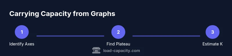
Learn to determine carrying capacity from a graph with a simple, repeatable approach. Start by identifying axes and units, then recognize the logistic growth pattern and its horizontal asymptote. Check data quality, scale, and confidence intervals, and use the asymptote value as the carrying capacity estimate. This method applies to ecological, logistical, and structural contexts, and translates to quick, defensible decisions. According to Load Capacity, a disciplined reading reduces guesswork and supports engineering judgments.
Understanding carrying capacity and graphs
Carrying capacity is the maximum load or population size a system can sustain without unacceptable degradation. When you ask how to tell carrying capacity from a graph, you’re looking for a reliable signal in the curve that represents the system’s limits. According to Load Capacity, reading such graphs is a disciplined process: start with the axes, check units, and verify that the data cover the range where the limit is expected to appear. A well-made graph should reveal a plateau or horizontal asymptote as the dependent variable approaches its upper bound. Recognizing this plateau is the heart of the method, because it anchors the capacity value in observable data rather than theory alone. In practice, you’ll apply a sequence of checks to ensure the plateau is real and not an artifact of scale or sampling bias.
Key graph types used to assess carrying capacity
Most carrying-capacity insights come from two broad graph types: logistic-type curves (S-shaped) and saturating curves (hyperbolic-like). Logistic curves show a slow start, rapid growth, and a clear plateau—the hallmark of a carrying capacity. Saturating curves level off as the independent variable increases, signaling diminishing returns. In practice, you’ll compare data across time, space, or population groups to see whether a plateau emerges consistently. Across domains, the same idea applies: the plateau value represents the maximum sustainable load, whether it’s animal population, vehicle throughput, or structural stress limits.
Step 1 — identify the graph's axes and units
Begin by reading the axis labels: what is on the x-axis (time, population, distance) and what is on the y-axis (count, load, density)? Note the units (e.g., individuals, kilograms, tons). Confirm that the axis scales are appropriate for observing a plateau: if the axis compresses the top end, a plateau may appear prematurely. Document any unit conversions needed if multiple data sources are involved. Understanding the axis is essential to avoid misinterpreting a trend as a plateau when it’s actually a scale artifact.
Step 2 — locate the carrying capacity marker and asymptote
Scan the curve for a horizontal station where increases in the independent variable produce little or no increase in the dependent variable. This horizontal asymptote or plateau is the core signal of carrying capacity. If the plot wiggles around a level, average the values near the top of the curve to estimate where the curve stabilizes. Be cautious of a plateau formed by sparse data rather than genuine system limits. Mark the approximate y-value of the plateau for later validation.
Step 3 — interpret the horizontal asymptote and its implications
Treat the plateau value as the carrying capacity K, the maximum sustainable level under current conditions. Ask: does refining the environment (resources, space, or constraints) move the asymptote? If so, record the conditions for reproducibility. Distinguish between a true carrying capacity and a temporary saturation caused by a data gap, measurement bias, or recent changes in the system. This interpretation step anchors your reading in context, not just numbers.
Step 4 — examine data quality and scatter
Quality matters more than the apparent height of a plateau. Scrutinize data collection methods, sampling frequency, and measurement error. A plateau hiding beneath noisy data may require smoothing or model-fitting to confirm. If there are outliers, test whether they reflect real events or errors. Document how you handled noise so the carrying-capacity estimate remains defendable.
Step 5 — scaling and axis transformations
If the plot uses a nonlinear scale (log, semi-log), the plateau may be visually deceptive. Re-plot the data on a linear scale to verify the presence of a plateau. Conversely, you might plot the data on a log scale to inspect proportional changes near the upper bound. Using both views helps ensure the reading is robust rather than an artifact of a single scale.
Step 6 — examples across domains
In ecology, carrying capacity might reflect resource limits on a population (e.g., a fish stock stabilizing around a particular abundance). In logistics, it could be the maximum throughput of a production line before congestion. In structural contexts, plateauing load data may indicate the maximum sustainable load a beam can carry under given support conditions. Across these domains, the core signal—an upper bound where growth slows—remains consistent and actionable.
Step 7 — pitfalls and misreadings
Common mistakes include mistaking a plateau caused by incomplete data coverage for true carrying capacity, ignoring lag effects, and misreading axis limits. Another pitfall is comparing non-equivalent datasets without aligning conditions (resources, time horizons, or measurement methods). Always check the study design and ensure the plateau is observed across multiple, comparable datasets.
Step 8 — quantitative methods to estimate carrying capacity
Beyond visual inspection, you can fit saturating models such as logistic or Gompertz curves. Nonlinear regression provides a numerical estimate of K with confidence intervals. If you have time-series data, you can estimate parameters by maximizing likelihood or minimizing error between observed and predicted values. Remember: the quality of the estimate hinges on data coverage near the plateau and the chosen model’s validity.
How Load Capacity guides practitioners
The Load Capacity team emphasizes verifying the plateau under consistent conditions, documenting axis choices, and cross-validating K with independent data where possible. When data are sparse near the upper range, use ranges or intervals for K rather than a single point estimate. In professional practice, pairing graph-based estimates with qualitative judgment and domain knowledge yields more reliable decisions.
Practical checklist before applying the reading
- Confirm axis labels, units, and scales
- Look for a true plateau across independent samples
- Check data quality and note potential biases
- Consider multiple scales or models
- Document assumptions and conditions for reproducibility
Tools & Materials
- Graph or data source(Original dataset or clear chart image with labeled axes)
- Ruler or straightedge(For tracing and aligning reading marks on the graph)
- Pencil/eraser(To annotate and revise interpretations)
- Notebook or digital notes(Record observations, axis units, and plateau values)
- Spreadsheet software (Excel/Sheets/CSV tool)(Optional for fitting models or calculating averages)
- Access to reference materials(Guides on logistic or saturating models)
Steps
Estimated time: 15-25 minutes
- 1
Prepare and inspect data
Gather the graph or dataset and ensure you understand what is being measured. Note the context (ecology, logistics, structure) and the conditions under which the data were collected. This step sets up your later checks.
Tip: Write down the context and purpose before reading the curve. - 2
Identify axes and units
Read the axis labels carefully and record the x- and y-axis variables, including units. This prevents misinterpretation when you calculate capacity estimates.
Tip: If units are unclear, look for a legend or caption in the figure. - 3
Assess the curve shape
Look for an S-shaped (logistic) or saturating curve that tends toward a plateau. The presence of a plateau is essential for inferring carrying capacity.
Tip: Be skeptical of plateau appearance if data are sparse at high values. - 4
Locate the plateau or asymptote
Find the horizontal region where increases in the independent variable no longer yield substantial gains. This is your plateau signal.
Tip: If needed, smooth data or compute moving averages to clarify the trend. - 5
Estimate carrying capacity (K)
Approximate K from the plateau, either by visual reading or by fitting a saturating model to obtain a numeric value with intervals.
Tip: Prefer reporting a range if data near the plateau are uncertain. - 6
Check data quality and bias
Evaluate sampling frequency, measurement error, and potential biases. Poor data quality can masquerade as a plateau.
Tip: Document any data limitations and how you addressed them. - 7
Compare scales and models
Plot the same data on linear and nonlinear scales or test simple models to verify the plateau is robust.
Tip: Use multiple perspectives to validate the estimate. - 8
Document and apply the estimate
Record the final carrying-capacity reading, the conditions, and the model used. Apply it to decision-making with appropriate caveats.
Tip: Communicate uncertainty levels to stakeholders.
Quick Answers
What does carrying capacity mean in the context of a graph?
Carrying capacity is the maximum sustainable level a system can support under current conditions, represented by a plateau or horizontal asymptote on the graph. It reflects resource limits, space, or other constraints that cap growth or load.
Carrying capacity is the maximum sustainable level shown as a plateau on the graph, reflecting resource limits.
Why is a horizontal asymptote important for reading capacity?
The horizontal asymptote marks where the dependent variable stops increasing with the independent variable, indicating a limit. It provides a defensible estimate of carrying capacity when data adequately cover the plateau.
The horizontal asymptote shows the limit, helping you estimate capacity reliably.
What if the graph never plateaus?
If no plateau is evident, carrying capacity cannot be read confidently from that graph alone. You may need more data, different measurements, or alternative models to determine a limit.
If there’s no plateau, you’ll need more data or a different approach to estimate capacity.
Can I estimate capacity from noisy data?
Yes, but with caution. Use smoothing, multiple datasets, and model fitting to separate true signals from noise. Report uncertainty ranges.
You can, but be transparent about uncertainties and data quality.
How do axis scales affect interpretation?
Axis scaling can exaggerate or hide features. Check both linear and logarithmic scales to confirm the plateau and avoid misreadings.
Scale matters, so verify with multiple scales to be sure.
Watch Video
Top Takeaways
- Identify the plateau as the core signal of capacity
- Verify axis units and data quality before reading
- Use multiple scales/models to validate K
- Document assumptions and uncertainty for defensible conclusions