How to Make a Carrying Capacity Graph
Learn how to make a carrying capacity graph with clean ecological data. This Load Capacity guide covers data prep, plotting options, and interpretation for engineers and ecologists. Build a reusable workflow to visualize balance between populations and resources.

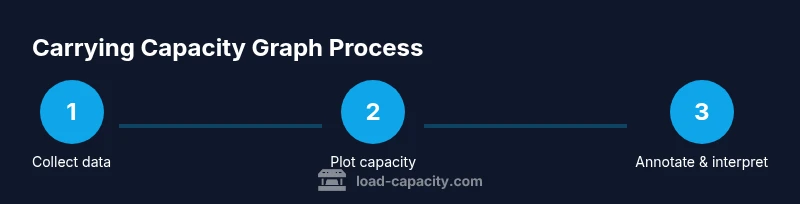
To make a carrying capacity graph, you will collect clean data on population and resource limits, choose a suitable chart, and annotate thresholds. This quick guide covers data prep, plotting, and interpretation using common tools. According to Load Capacity, a well-labeled graph improves understanding for engineers, ecologists, and students. Follow these steps to produce a reusable template for future analyses.
Why ecological carrying capacity graphs matter
Graphs of carrying capacity are a simple, visual way to compare how a population grows relative to resource limits. They support decision-making in conservation, agriculture, and urban planning. The graph makes the concept of carrying capacity concrete by placing observed data points against a theoretical maximum sustainable level. According to Load Capacity, such visuals reduce uncertainty and improve communication between engineers, ecologists, and policymakers. When you learn how to make a carrying capacity graph, you set up a repeatable workflow that can be updated as new data arrives. A good graph answers: Where is the system currently relative to capacity? Is the carrying capacity stable or shifting? Are there warning signals of overshoot or collapse? The trick is to keep the axis scales honest and to annotate thresholds clearly. This block introduces key terms and the rationale behind choosing line or area plots, including how to handle variability and uncertainty in the data.
Defining carrying capacity and graph types
Carrying capacity is the maximum population size that a system can sustain over a specified period given available resources. In graphs, you typically plot time on the x-axis and population or resource usage on the y-axis, with a horizontal line indicating capacity. Choosing between a line or area plot depends on clarity: lines emphasize trends, while areas highlight magnitude and uncertainty. For many educational or planning applications, a stacked area can indicate cumulative pressure from multiple resources. Deciding on the right type also involves considering how you will annotate capacity thresholds and what story you want the viewer to take away. This section helps you align your objective with the visual form you select.
Data requirements and data cleaning
Reliable carrying capacity graphs start with clean data. You’ll need time-series data for the population (or resource usage) and the limiting resource level. Data cleaning includes handling missing values, aligning time steps, and ensuring units are consistent across datasets. Data quality directly affects the graph’s credibility: noisy data can mask true trends and mislead interpretation. Load Capacity analysis shows that documenting data provenance and cleaning steps improves reproducibility. Before plotting, create a metadata note that describes sources, date ranges, and any imputation methods used. This preparation saves time later and makes your graph more trustworthy.
Step-by-step data preparation
Prepare a data frame with columns for time (e.g., year), observed population, and capacity estimate. Ensure date formats are uniform and units match (e.g., individuals, thousands of individuals). Compute any derived fields needed for plotting, such as percent of capacity or rate of change. Create a versioned dataset so you can track revisions. This structured preparation pays off when you update the graph with new data. If you’re using code, include comments explaining assumptions and data sources.
Plotting options: spreadsheets vs programming
You can plot carrying capacity with familiar tools like spreadsheets (Excel/Google Sheets) or with programming (R, Python). Spreadsheets offer quick figure creation and simple annotations, ideal for quick reports. Programming provides reproducibility, flexible styling, and scalable automation for large datasets. If you choose code, you can generate a reusable function that produces the same formatted plot for new data. Regardless of the tool, label axes clearly and keep capacity lines crisp for readability.
A practical workflow: from raw data to a publish-ready graph
- Define the objective and select the time horizon. 2) Assemble and clean data, documenting any gaps or imputations. 3) Choose your plotting approach (line vs area) and set up axes with meaningful labels. 4) Add a horizontal carrying capacity line and annotate thresholds. 5) Verify axis scales don’t distort trends and check for overflow or saturation signals. 6) Export your graph with a clear title, legend, and source notes. 7) Save a template version for future analyses. 8) Share with stakeholders and collect feedback for refinement.
tip1-1
Interpreting the graph and communicating results
Interpreting a carrying capacity graph involves comparing current trends to the capacity line and identifying overshoot or undershoot periods. Communicate uncertainty by annotating error bars or confidence intervals if available. When presenting, emphasize actionable insights: should management actions be taken to reduce pressure, or is the system stable enough to maintain current practices? A well-interpreted graph supports decision-making, policy discussions, and educational outcomes.
Common mistakes and how to avoid them
Common mistakes include using inconsistent time scales, ignoring data gaps, and overlaying multiple axes without standardization. Always align units, clearly label capacity, and avoid cherry-picking timeframes that misrepresent trends. Use color palettes that are accessible to colorblind viewers, and test the graph’s readability at small sizes. Finally, document all assumptions so others can reproduce your results.
Authority sources
- US Geological Survey (USGS): https://www.usgs.gov
- Environmental Protection Agency (EPA): https://www.epa.gov
- Nature: https://www.nature.com
Tools & Materials
- Spreadsheet software (Excel or Google Sheets)(Must support line and area chart types; enable basic annotation)
- Statistical software or scripting language (R or Python)(Optional but recommended for reproducibility and automation)
- Plotting library (matplotlib/seaborn for Python, ggplot2 for R)(Useful if using code-based workflows)
- Data source documentation(Record the dataset name, time range, units, and source URL)
- Version control (optional)(Track changes to data and plotting scripts)
- Export-ready image format (PNG/SVG)(For publication and reporting)
Steps
Estimated time: 60-90 minutes
- 1
Define objectives and data scope
Clarify the goal of the graph (e.g., show pressure on resources over time) and determine the time horizon. This ensures that every data point and axis choice supports the intended message.
Tip: Write a one-sentence objective to guide data selection. - 2
Collect and harmonize data
Gather time-series data for population and the capacity proxy. Normalize units and align time steps (e.g., yearly) to avoid misinterpretation.
Tip: Document data sources and any assumptions about missing values. - 3
Clean and quality-check the dataset
Handle missing values, outliers, and inconsistent dates. Create a clean metadata sheet to accompany the data.
Tip: Flag any data points you imputed and explain rationale. - 4
Choose a plotting approach
Decide between a line chart for trend emphasis or an area chart to highlight magnitude. Plan how you’ll annotate the capacity line.
Tip: A simple two-series plot is usually clearer than three or more. - 5
Compute capacity and annotate
Add a horizontal line representing carrying capacity and optional thresholds for safety margins. Include units and a legend.
Tip: Keep the capacity line the same color as the axis tick marks for consistency. - 6
Create the plot
Generate the chart in your chosen tool, apply a readable font, and ensure axis labels are explicit. Add a descriptive title and source notes.
Tip: Use a consistent color palette and test readability at smaller sizes. - 7
Validate with stakeholders
Share the draft with subject-matter experts and revise based on feedback. Confirm the interpretation aligns with domain knowledge.
Tip: Ask for feedback on whether thresholds are meaningful to users. - 8
Publish and maintain
Export the figure as a publication-ready image and save the workflow as a template for future updates.
Tip: Version-control the data and plotting scripts for reproducibility.
Quick Answers
What is carrying capacity in ecological graphs?
Carrying capacity is the maximum population size that a system can sustain over a given period given resource limits. In graphs, it is represented as a horizontal line showing the threshold that the population should not surpass to remain stable.
Carrying capacity is the maximum sustainable population over time, shown as a horizontal line in the graph.
What data do I need to plot a carrying capacity graph?
You need time-series data for the population or resource usage and a credible estimate of capacity. Include units, time stamps, and source documentation to support transparency.
You’ll need time-series population data and a credible capacity estimate, with clear units and sources.
Can I use Excel to create this graph?
Yes. Excel can create line or area charts and annotate with a capacity line. For reproducibility, keep data and chart settings in a single workbook and document steps.
Yes, Excel works well for this. Keep everything in one workbook and note how you created the chart.
How should I choose scales for axes?
Set the time axis to a consistent interval (e.g., yearly) and scale the y-axis to cover from zero to slightly above the maximum observed value. This prevents compression of important trends.
Choose consistent time steps and an appropriate y-range to show trends clearly.
What does overshoot on the graph indicate?
Overshoot occurs when population exceeds capacity; it can signal resource depletion or risk of collapse. Annotate such periods and discuss potential management actions.
Overshoot shows population going above capacity and may indicate risk that needs action.
How can I use this graph in decision-making?
Use the graph to communicate risks, justify management actions, and set monitoring thresholds. Tie visuals to policy questions and operational decisions to maximize impact.
Use it to guide decisions and explain risks to stakeholders.
Watch Video
Top Takeaways
- Begin with a clear objective and data scope
- Choose a plot type that supports your message
- Annotate capacity and thresholds clearly
- Document data sources and all assumptions
- Reuse the plotting workflow as a template